The Only Color Combinations Cheat Sheet You’ll Ever Need
Article
by
Ashly Winchester
Our lives are filled with color. Color influences our moods, feelings, and perceptions, as well as our decision-making processes. That means your choices in color combinations play an essential role in building your brand and website.
Choosing the best color combination is both a science and an art. Although not everyone was born with an eye for color and an innate ability in graphic design, there are methods and principles that you can use to choose the best color combinations to make both a strong impression and achieve your desired effect. We put together a cheat sheet to help ease the stress of
Handshake is a wholesale marketplace filled with high-quality products from US-based brands. Join now to see if you're eligible for $1,000 to spend with a 60-day head start on selling the products you order before there’s anything to pay for them.
Before we start picking out color combinations, it’s a good idea to have a basic understanding of colors, the terminology, how colors work together, emotional connections to them, and the role they play in creating a reaction.
Let’s start by reintroducing the visual representation of the relationships of color hues: the color wheel.
The Color Wheel
Whether it was as far back as elementary school or as recent as that last time you tried to use Photoshop, most of us have seen a version of the color wheel at some point. The history of this essential guide for artists and designers goes way back to the early 1700s. Grasping the fundamentals of the color wheel will help significantly in your color combo choices, especially if you’re not well-versed in the universe of color theory.
How Does the Color Wheel Work?
A simple color wheel consists of 12 color hues arranged around a central hub.
A color wheel consisting of primary, secondary, and tertiary colors
All colors come from some combination of primary colors. The three primary colors are red, blue, and yellow. These three colors are essentially the parents of all the other colors.
Primary colors highlighted on a color wheel
Mixing equal parts of any two of the primary colors results in the creation of secondary colors.
Red + Blue = Purple.
Blue + Yellow = Green.
Red + Yellow = Orange.
Secondary colors highlighted on a color wheel
Tertiary colors are those that come from mixing one of the primary colors with one of the nearest secondary colors. Tertiary colors are found in between all of the primary colors and secondary colors.
Red + Orange = Red-orange.
Yellow + Orange = Yellow-orange.
Yellow + Green = Yellow-green.
Blue + Green = Blue-green.
Blue + Purple = Blue-purple.
Red + Purple = Red-purple.
Tertiary colors highlighted on a color wheel
Color Terminology
Just like any area of study, the world of art, design, and color is rife with technical language. A general comprehension of color terminology will be helpful, both here and in the future of your business. Let’s introduce you to the basic terms most used in the chromatic world.
Hue – The terms “color” and “hue” are often used interchangeably by artists and designers. For all intents and purposes, this will get you by but the words “color” and “hue” actually mean different things. In general, “color” is used to refer to all, well, colors, including black, white and grey. While “hue” refers to the origin of the color we see. It is the base of the color we see and is always one of the six primary and secondary colors on the color wheel.
Tint – A “tint” is a lighter version of a given hue. It is a hue that has only white added to it. Sometimes a tint can seem brighter than the original hue, but it is just a paler version. A tint can range from a hue that is barely lighter than the original, to almost white with a tiny amount of color in it.
Shade – This is the opposite of a “tint.” A “shade” is a hue with only black added to it. It can, of course, include varying amounts of black, and the resulting color may be barely darker than the original hue, or it may be almost black. An easy way to remember this one is to think of how the grass in the shade of a tree seems darker than the grass in the sun.
Tone – This is very similar to “tint” and “shade,” only instead of being a hue with white or black added to it, it is a hue with only grey added to it. The grey that is added to make a “tone” must only consist of black and white, no other colors (many colors that are considered grey actually have a base that is a hue). Toned colors tend to be viewed as more sophisticated than pure hues.
Warm Versus Cool – “Warm” colors are those that resemble or symbolize heat, while “cool” colors are attributed to ice and cooler temperatures. For example: red, orange, yellow, and red-purple are warm colors, while blue, purple, green and blue-green are cool colors.
The Psychology of Color
Now that we’ve had an introduction to color theory, we should take a quick peek at the psychology of color. This is important because the colors and hues you choose set the tone for how your customers and clients feel about your website, business cards, and/or office space. Choosing a color combination is not about choosing the colors that you like, it’s about choosing the colors that evoke the emotions that you seek from your audience.
“Color is a power which directly influences the soul.” ~ Wassily Kandinsky
Below is a quick rundown of different hues and the feelings they often elicit:
Warm colors usually create energy and excitement, and evoke passion, while cool colors calm and relax.
If you’re interested in reading further about the psychology of color and how color meanings affect you, read the full post here.
Now that we have an understanding of color as applied to art and design, lets get on to the fun stuff…
Color Combinations
Once you’ve decided on your desired psychology, it’s easy to pick out colors that go together. Using a color wheel, you can quickly pick out color combinations that are monochrome, complementary, analogous, split, triad, or tetradic. These different color schemes guide your options between selecting contrasting colors and harmonious colors, depending on the desired effect you want to achieve.
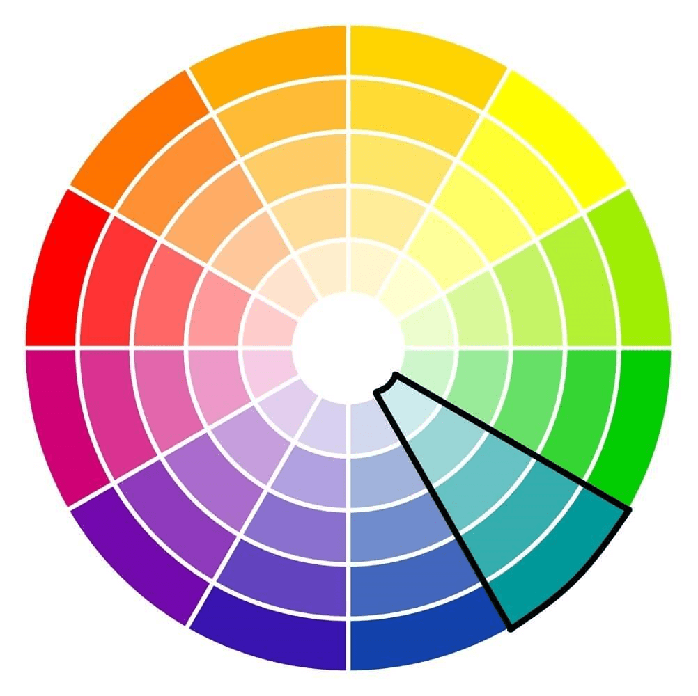
Monochrome Combinations
A monochrome color combination is different variations of a single hue. This combination consists of varying tints, shades, and tones of the chosen hue. For example: dark blue, slightly lighter blue, and light blue. These combinations are great for simplifying busy designs and creating a harmonious, visually appealing look. It’s a great color scheme strategy if you want your brand to be identified with a particular color. It’s also a useful to show progression in a design, such as a tiered price list, or to create a more sophisticated looking design using a brighter color.
Complementary Combinations
Complementary colors exist directly across from one another on the color wheel. These colors have high contrast to one another and can make your design boldly stand out with high contrast. However, if used improperly, they can be very visually jarring.
Generally speaking, when using complementary colors, you do not want to use them equally in your design. You want to pick one of the hues as your main color, then use the complementary color to highlight and to make certain important items stand out.
These contrasting color schemes can be found in nature as well, and can lend a vibrant, yet natural, feel to a design. Take, for example, orange coral standing out in the blue of the ocean, or lavender against the soft green of the foliage.
Examples of complementary color combinations:
Red and green.
Blue and orange.
Yellow and purple.
Yellow-green and red-purple.
Red-orange and blue-green.
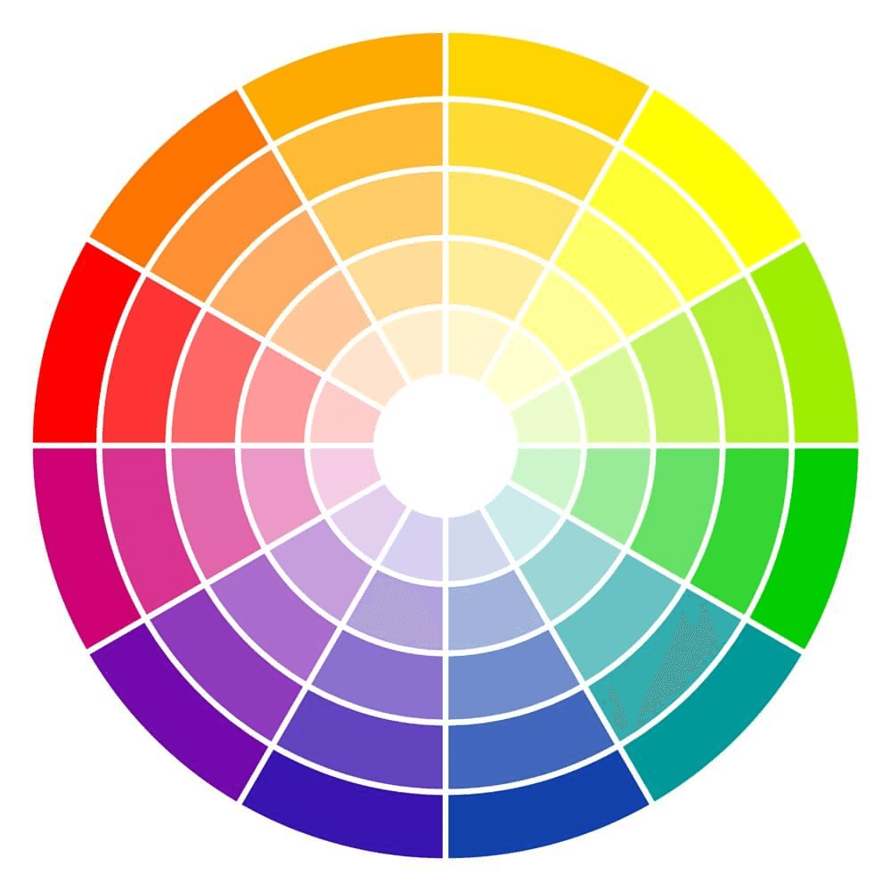
Above is an example of a complementary combination: blue and orange. Notice how they are directly across from each other on the color wheel.
Analogous Combinations
These color combinations sit directly side by side on the color wheel. The harmonious blends evoke serenity and peace. Some say this is due to analogous combinations existing so frequently in the natural world. It is recommended that you choose a primary color as a base, then choose two more to highlight. This usually works best with a secondary and a tertiary color. Make sure your base color dominates, and the other two colors highlight, not overwhelm. Also, be wary of choosing colors that are too closely related, as they may blend together and wash out your design.
Examples of analogous combinations:
Violet, blue, and teal.
Red, fuchsia, and purple.
Red, orange, and yellow.
Green, blue, and purple.
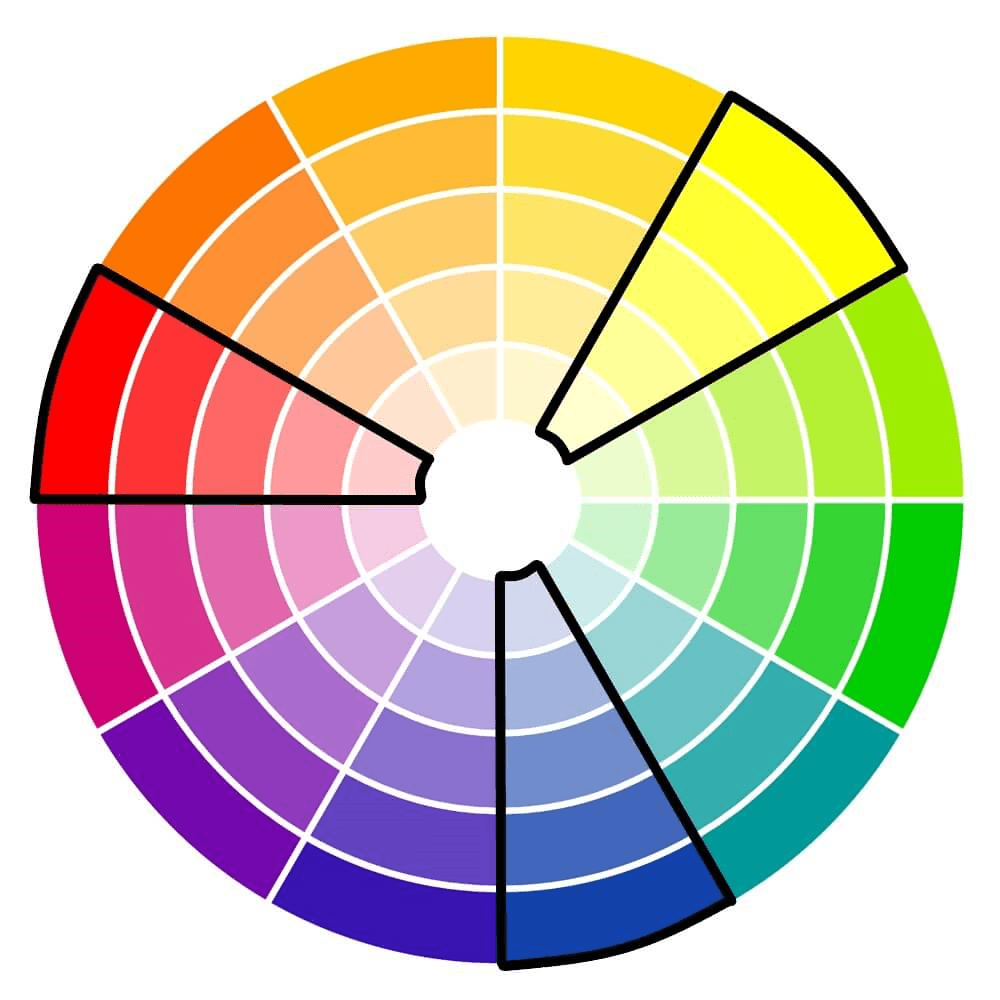
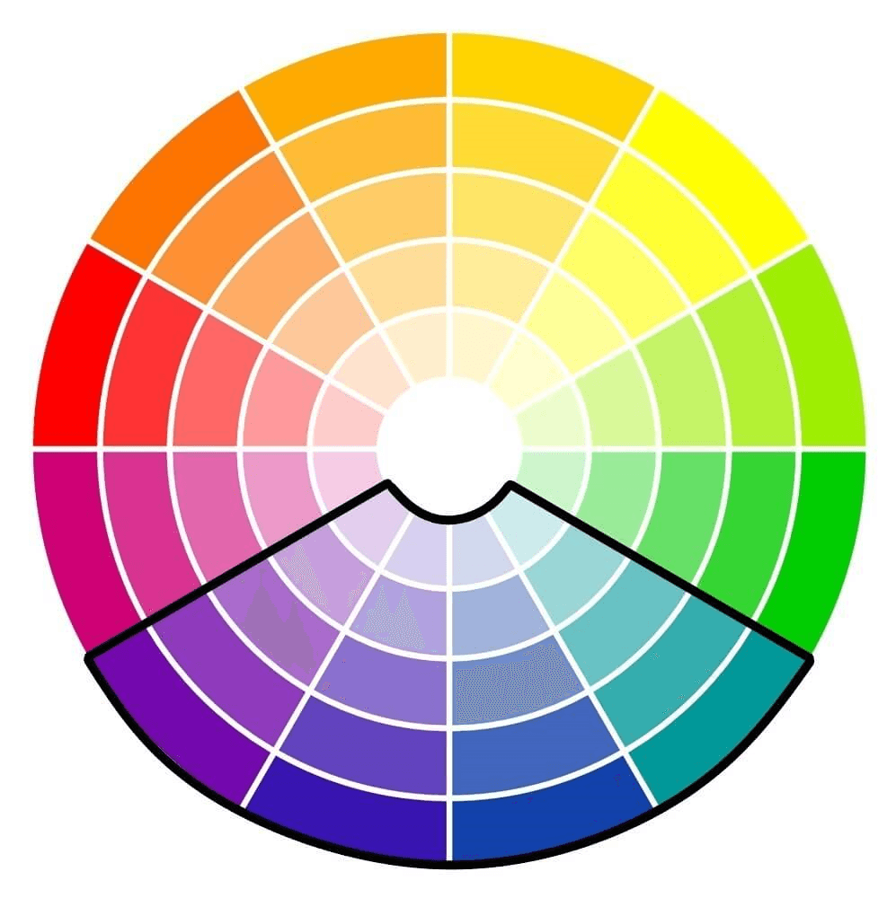
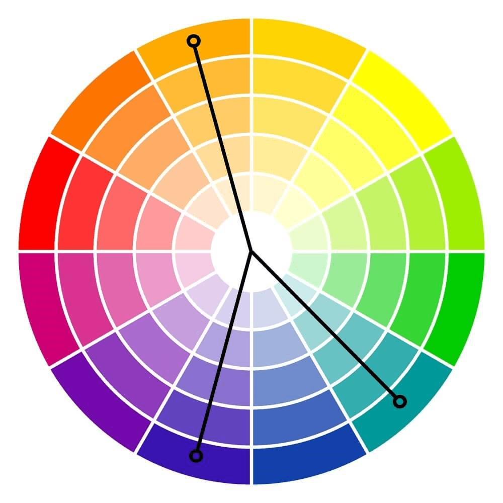
Split Complementary Combinations
This is a variation of the complementary color scheme. However, instead of two colors directly across from each other, this combination is made up of one color and the colors on either side of the complement. This strategy adds more variety than complementary color schemes by including three hues, without being too jarring or too bold. Using this method, we end up with combinations that include both warm and cool hues that are more easily balanced than those of the complementary color schemes.
Examples of split complementary color schemes:
Red, blue-green, and yellow-green.
Blue, red-orange, and yellow-orange.
Yellow, blue-purple, and red-purple.
Purple, yellow-orange, and yellow-green.
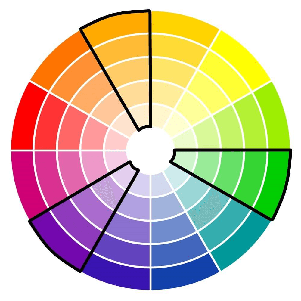
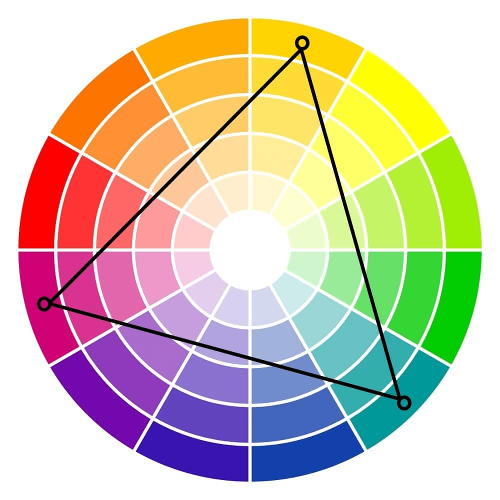
Triadic Combinations
These simple color combos are variants of the split complementary color scheme. The colors in this composition are found equally spaced on the color wheel. Take an equilateral triangle and place it on the color wheel. The colors at each point come together to make the triadic combination.
These color combinations tend to be quite vibrant, even when toned down, tinted, or shaded. The colors can come across as playful, or adolescent. Because of this, you will want to be careful with the balance of these colors. Choosing one as the main color and using the other two as accents is a strong place to start.
Examples of triadic combinations:
Red, yellow, and blue.
Purple, green, and orange.
Blue-purple, red-orange, and yellow-green.
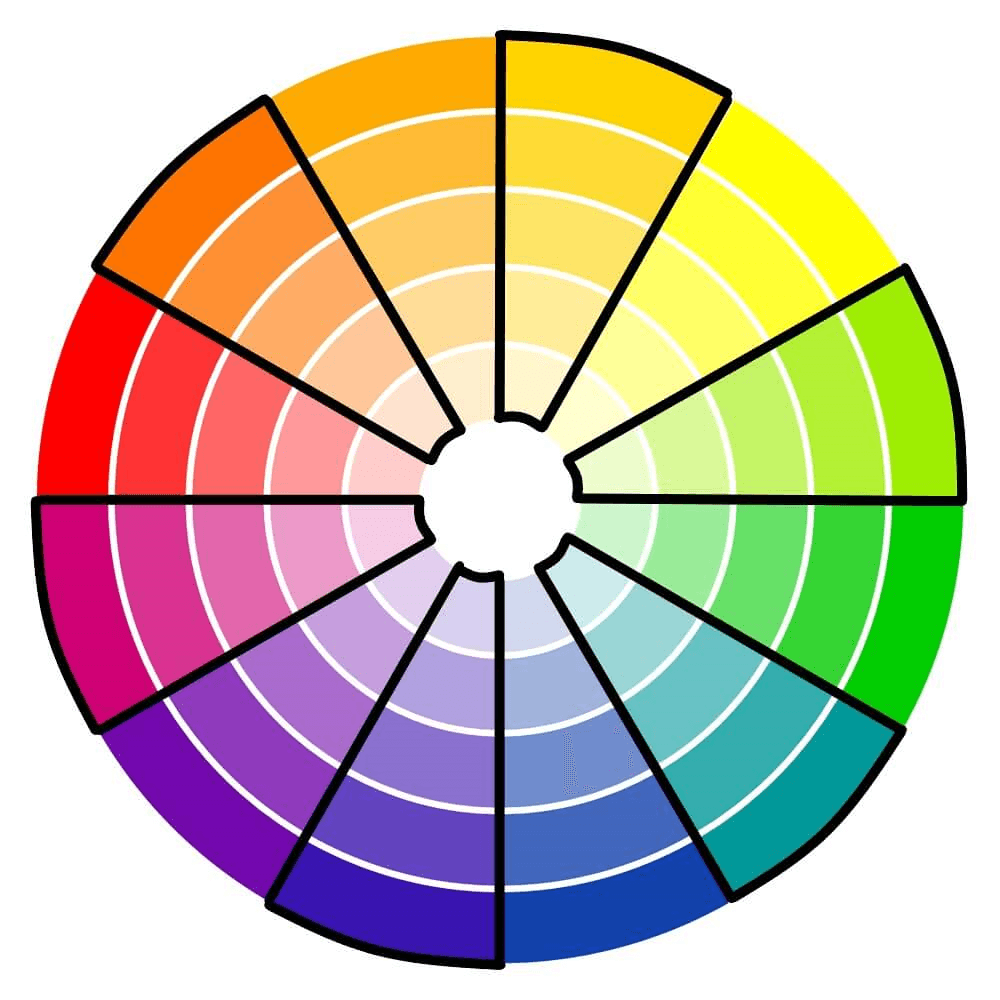
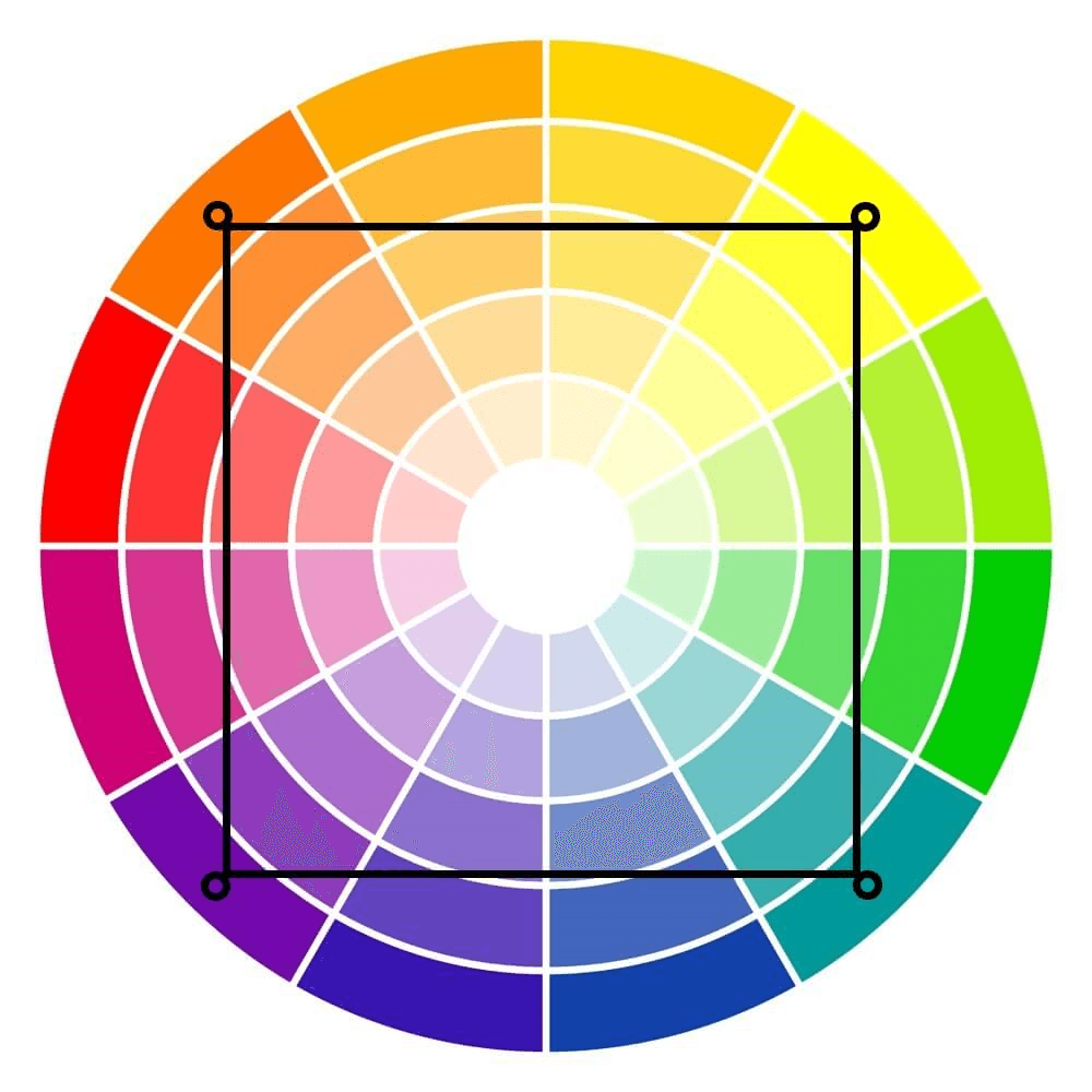
Tetradic Combinations
Like the triadic combination, the tetradic color combination involves colors that are equidistant apart. Except these color combos use four colors instead of three. You can find a tetradic combination by placing a square on the color wheel and choosing the colors at each corner, or by choosing two opposing sets of complementary colors.
These color combinations are always loud and fun, and the vibrancy makes designs stand out. However, caution must be used in finding balance with these combinations because they can be easily overwhelming.
Examples of tetradic color schemes:
Red, green, blue-purple, and yellow-orange.
Yellow, purple, blue-green, and red-orange.
Experimentation Is Key
Unless you have a natural affinity or a background in art and design, choosing the best color combinations can be a little overwhelming at times. You won’t really know what your chosen color combinations will look like in your design until you actually apply them. That’s why experimenting with different hues, tones, tints, and shades can help you find the best color combinations for your purpose and desire. And help you deliver the message and feeling you intend.
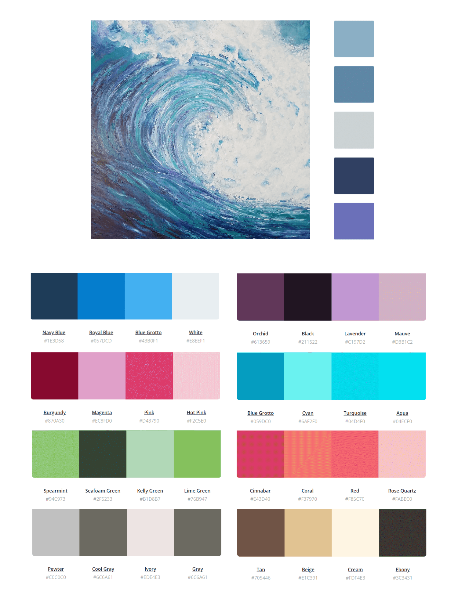
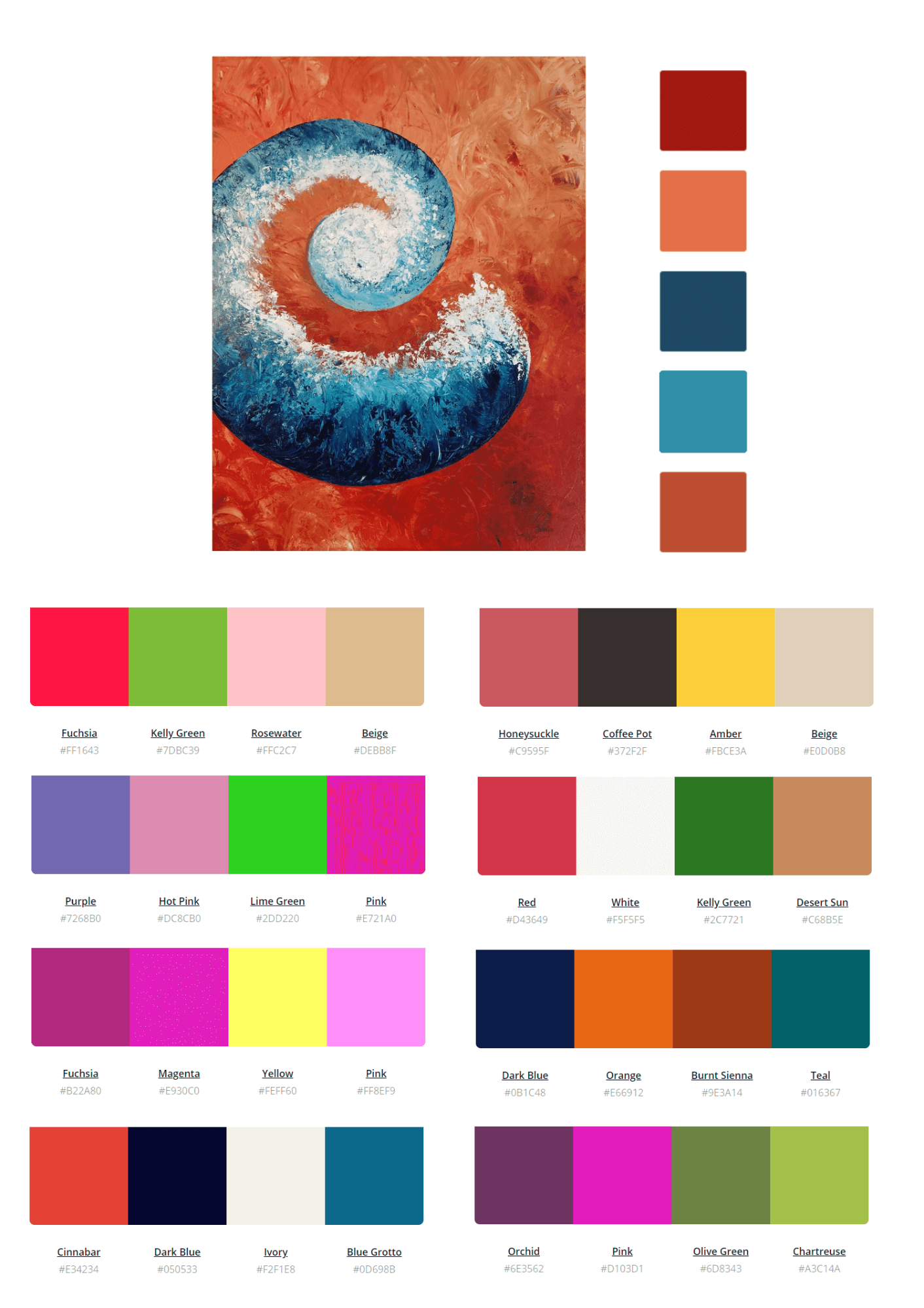
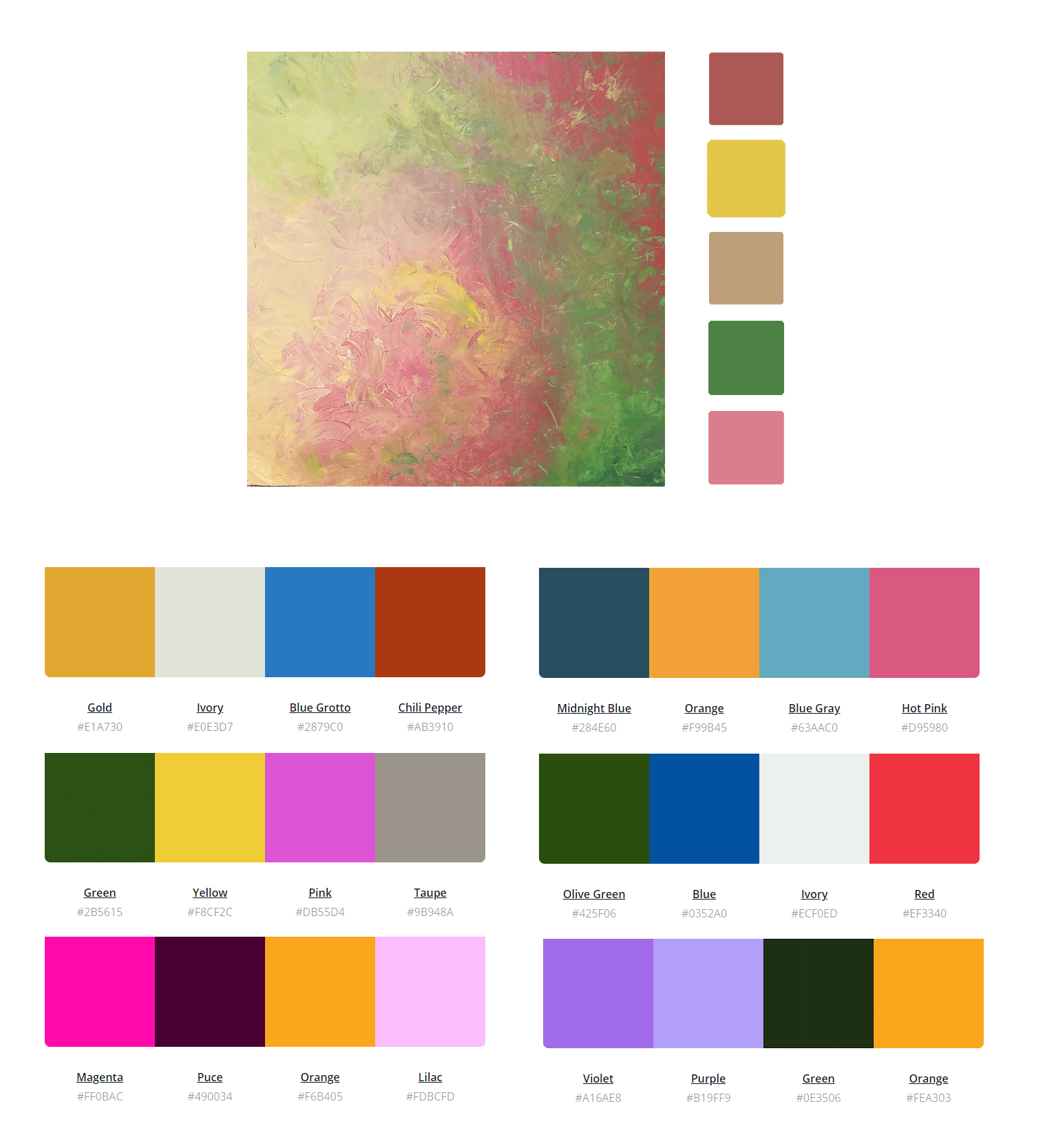
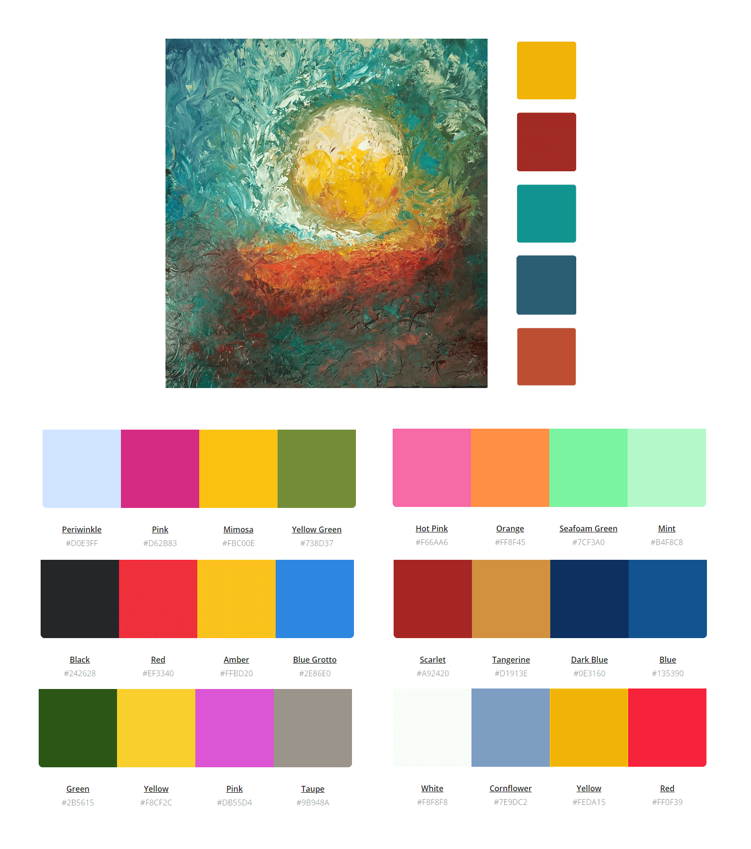
There are a number of apps and websites that can help with your decision-making process, too. We love the color palette generator at Canva where you can drag and drop a favorite photo to retrieve a color palette.
Whether you’re looking for a color scheme for your website, business cards, or office, we’re confident that you will develop the best color combination for your needs.